Laboratory exercise 5
User interface development
The application’s user interface (UI) is what you see on the screen: text, images, buttons, and many other types of elements, and how they are arranged on the screen. It is the way the application presents things to the user and how the user interacts with the application.
Clickable button, Text message in a card, Text input field
Each of these elements is called a UI component. Almost everything that is seen on application’s screen is a UI element (also known as a UI component). They can be interactive, like a clickable button or an editable input field, or they can be decorative images.
Jetpack Compose
Jetpack Compose is a modern UI development toolkit for Android. Compose simplifies and speeds up Android UI development with less code, powerful tools, and the intuitive capabilities of Kotlin. With Compose, you can build your UI by defining a set of functions, called composable functions, that accept data and describe UI elements.
Composable functions
Composable functions are the basic building block of the user interface in Compose. A composable function:
- Describes a part of your user interface.
- Returns nothing.
- Takes some input and generates what is displayed on the screen.
Scalable pixels
Scalable pixels (SP) is a unit of measurement for font size. UI elements in Android apps use two different units of measurement: density-independent pixels (DP), which you later use for layout, and scalable pixels (SP). By default, the SP module is the same size as the DP module, but it resizes based on the user’s preferred text size in the phone’s settings.
The AndroidX library (an extension for Android) contains a set of libraries and classes that help speed up application development by providing you with core functionality. You can access the classes, properties, and other artifacts using the androidx package.
User interface hierarchy
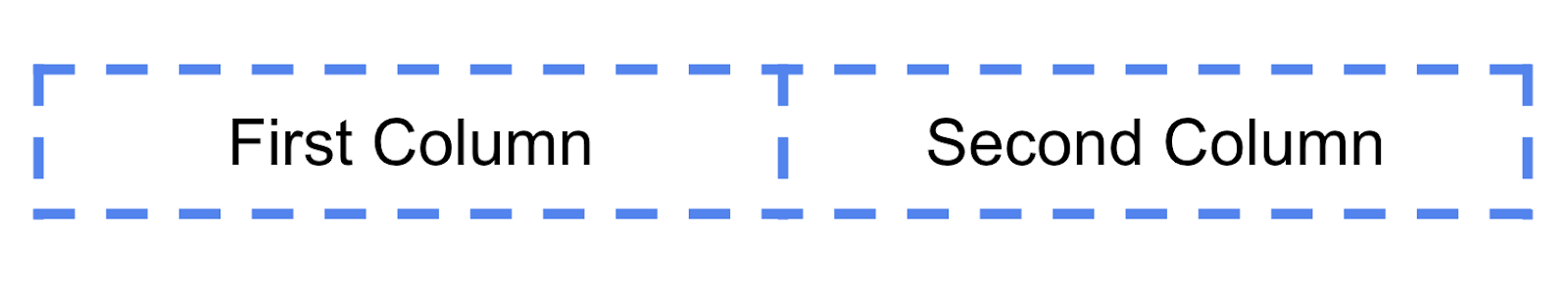
The UI hierarchy is based on containment, meaning that a component can contain one or more components, and sometimes the terms parent and child are used. The context here is that parent UI elements contain child UI elements, which in turn can contain child UI elements. The three basic, standard layout elements in Compose are Column, Row, and Box.
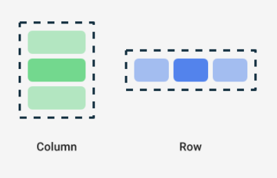
Column, Row, and Box are Compose functions that take Compose content as arguments, so you can place elements inside these layout elements. For example, each child element in a Compose element is placed horizontally next to each other in a row. Пример:
Row {
    Text("First Column")
    Text("Second Column")
}
The Compose function uses curly {} braces instead of parentheses. This is called Trailing Lambda Syntax. Kotlin provides a special syntax for passing functions as parameters to functions when the last parameter is a function.
When you pass a function as this parameter, you can use the trailing lambda syntax. Instead of putting the function inside the parentheses, you can put it outside the parentheses in curly braces. This is a recommended and common practice in Compose, so you should be familiar with how the code looks.
For example, the last parameter in a composable function is the parameter, a function that describes the child elements of the user interface. Let’s say you want to create a row that contains three text elements. This code would work, but it’s very cumbersome to use a named parameter for the trailing lambda
Example
Row(
    content = {
        Text("Some text")
        Text("Some more text")
        Text("Last text")
    }
)
Since the parameter is the last one in the function signature and you are passing its value as a lambda expression (it’s okay for now, if you don’t know what a lambda is, just familiarize yourself with the syntax), you can remove the parameter and the parentheses as follows:
Row {
    Text("Some text")
    Text("Some more text")
    Text("Last text")
}
Layout of user view elements
Layout is done with the modifier object, which is a collection of elements that decorate or change the behavior of Compose UI elements, such as padding, align. In addition, each UI element has its own layout parameters fontSize, lineHeight, textAlign, verticalArrangement, and others.
User interactions control
UI components provide feedback to the user of the device by the way they respond to user interactions. Each component has its own way of responding to interactions, which helps the user know what their interactions are doing. For example, if a user taps a button on the device’s touchscreen, the button will likely change in some way, perhaps by adding a highlight color. This change lets the user know that they have tapped the button. If the user doesn’t want to do that, they will know to lift their finger off the button before releasing it—otherwise the button will activate.
In many cases, you don’t need to know exactly how your Compose component interprets user interactions. For example, a Button relies on Modifier.clickable to know whether the user has clicked the button. If you’re adding a typical button to your application, you can define the button’s onClick code, and Modifier.clickable executes that code when appropriate. This means you don’t need to know whether the user has tapped the screen or selected the button with a keyboard; Modifier.clickable detects that the user has clicked and responds by executing your onClick code.
Application resources
Resource Manager is used to manage resources in the project. It can be started from View > Tool Windows. From it, various resources can be added to the project, including images. If a resource is not properly integrated with the project, it will not be able to be used. All resources that are added to the application receive an identifier, the resource identifiers are generated automatically and are described in the automatically generated class R.
Resources are retrieved using the Resource methods: stringResource, painterResource
Dynamic user interface
Composable functions are stateless by default, which means they do not contain a value and can be recomposed at any time by the system, which will reset the value. However, Compose provides a convenient way to avoid this. Composable functions can store an object in memory using the composable’s memory.
To store state, a variable in a Composable function must be defined as remember composable.
Remember composable element requires a function to be passed in. Also, composable observable to monitor changes to the object and notify the user interface that it needs to change. The function it takes as a parameter is the control function after a change occurs.
Tasks
Task 1
Create a Composable function for greeting text GreetingText with parameters: message: String and modifier: Modifier = Modifier. Visualize the function in the design panel. With the message “Happy Birthday Android!”
Task 2
Set fontSize = 100.sp check the result
Task 3
Set lineHeight = 116.sp check the result
Task 4
Add a new text element for the message from whom the greeting is, use fontSize = 36.sp
Task 5
Arrange the text elements in a row and in a column. Choose an appropriate layout option.
Task 6
Align text and user view elements with padding, verticalArrangement , align , and textAlign
Task 7
https://tuvarnabg.sharepoint.com/:u:/s/msteams_230e9b/EXtfPyFQ_3tAnBwEYE7-4XgB3w6hd6boqpZEw_RJEj-sgg?e=HW2dfN